PurPics

VISUAL STYLE for micro-influencer marketing startup

purpics logo


A lot of the branding process takes place before our clients even think about hiring us. Brands are developed at the start of a business through their interactions with their clients. They evolve through every point of contact… whether it’s a Instagram post, offer, or the copy on their website.

Our job is to identify the existing brand and display it visually… which is why designing for PurPics was an exciting opportunity!

PurPics is a startup that connects brands with students who promote their products in order to earn donations to a charity. It’s a whole new take on micro-influencing and it’s taking off. When PurPics approached us, they’d just been accepted into the Techstars accelerator program. they knew they would be presenting their pitch to numerous peers, mentors, and potential investors over the next few weeks and needed to level up their visual style big time. They had several existing decks with strong content, but the design was inconsistent and didn’t accurately reflect their brand personality.

The biggest challenge? PurPics needed a look that would appeal to both sides of their market… the college students AND the brands. PurPics had to be current and youthful, but also polished and professional.

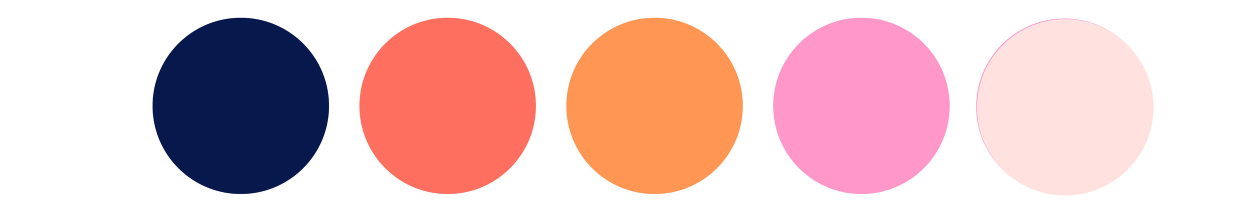
We started by reviewing the existing brand materials and developing a clearly defined personality & value system. Then we explored ways to evolve their existing color palette, which centered on an in-your-face hot pink that was a potential turn off to corporate clients.

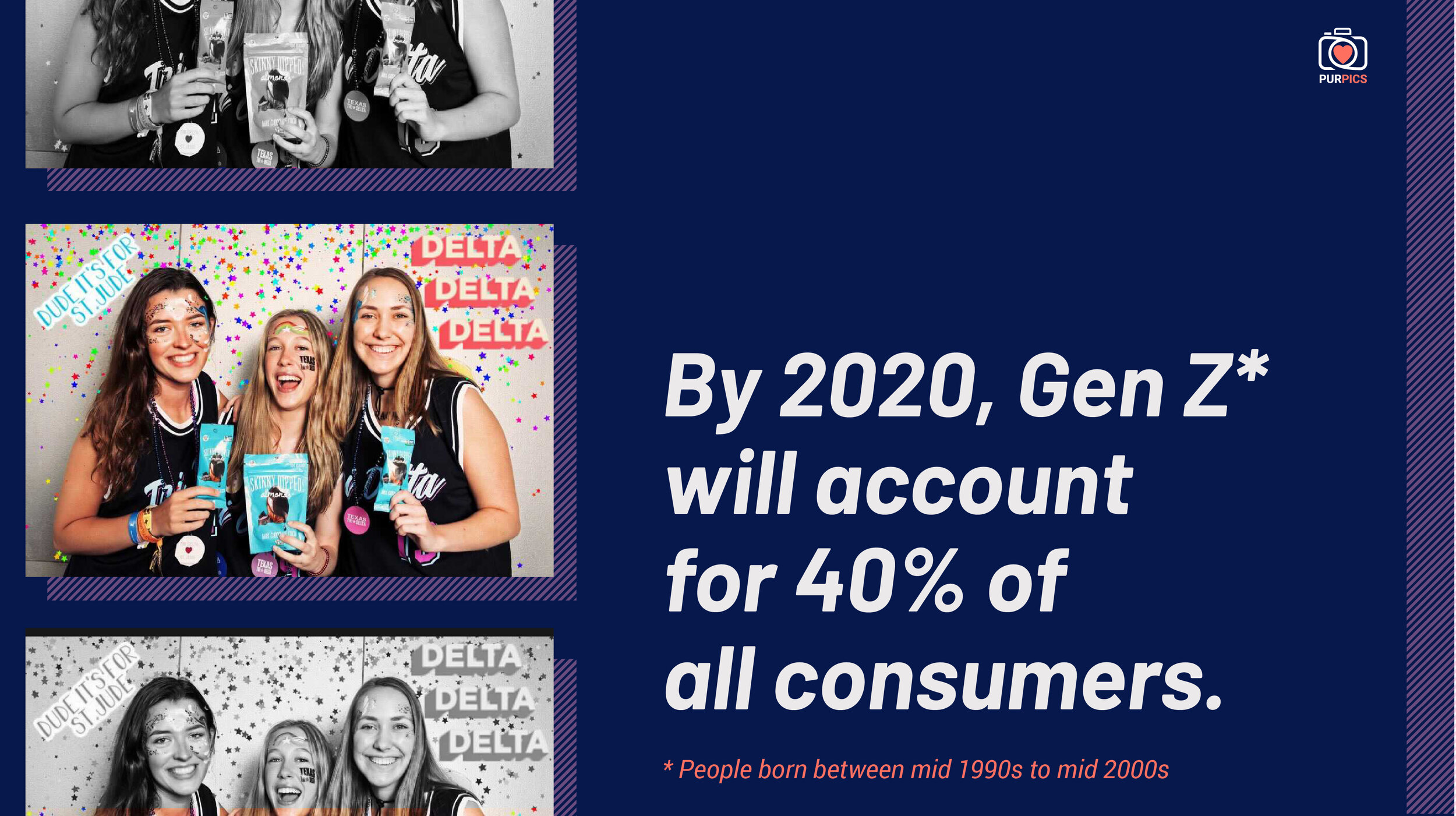
Since presentation templates were the most urgent, we dove into those first, building a design system that could be applied to other branded assets in the future, like their website, ads, and product platform. The palette is bold and youthful, and the color blocking layout is super flexible. The brand’s focus on authenticity is communicated through the use of user-generated images.

purpics moodboard
colors
purpics icons
sample slide

To close out the project, we packaged everything up into an extensive Brand Guidelines package so the new visual style could be applied easily to any marketing materials. These guys are ready to present to Techstars—and any other exciting ventures that might come up in the future!

Briana Lang
Little Artefacts

Design for artsan lighting trade show booth

littleartefacts_postcard_front.jpg

Imagine walking up & down the aisles of a trade show where all the booths look about the same. This happens often, but as secret trade show nerds we were thrilled when Little Artefacts contacted us to help them design a booth that showcased their products and their brand!

Little Artefacts is a creative small business that creates homemade, limited run lighting fixtures. They also collaborate with meticulously researched and selected artisans at the top of their craft—think ceramicists and woodworkers who create every piece to order. (So good, amiright?!)

We started by presenting four concepts to the client in the form of layout sketches and moodboards—minimalist, bohemian, cafe, and luxe—each with a color palette and ideas for furnishings, display styles, and materials.

Joshua, owner and lead designer of the firm, selected the bohemian design concept so we sourced rattan furniture, light woods, macrame plant hangers, and ethnic textiles to bring a little So Cal style to London. He was concerned the light fixture had a masculine aesthetic, so one of our goals was to highlight their feminine side and show how they could be used in a more feminine environment. We achieved this by displaying them with other warm, natural textures against an on-trend blush pink background.

LA_London_Moodboard_BOHEMIAN copy.jpg

Sourcing rental furniture, plants, and display fixtures from across the Atlantic was no small feat, but we handled every aspect for the client. We were so excited to find simple, sleek copper and natural wood fixtures from The Little Deer, a maker in Brighton, so we could support another artisan business as part of the project! We also coordinated with the show organizers to order all of the less pretty (but equally essential) parts of the booth design—electrical needs, rigging, flooring, paint, etc.

When we arrived in London, we discovered that the show organizers had painted the booth the wrong color! We had to pop into a home supply store nearby, choose a new color, and have it repainted before we could start installing our booth. Close call, but we made it work!

Little Artefacts is sometimes interiors, sometimes objects, sometimes architecture, and sometimes just adding a creative voice. We were so happy to add OUR creative voice to theirs and create some magic together!

This project is outside of our regular wheelhouse, but we got a lot of traffic to the booth just from word of mouth. Folks at the show were telling each other how unique the booth was and sending their friends to check it out—we’re pretty thrilled with that feedback!

little artefacts booth side view.jpg
little artefacts booth table.jpg
little artefacts display fixtures.jpg
little artefacts booth square
little artefacts table lamp.jpg
Briana Lang
The Proppe Shoppe

Branding for a stylish prop supplier


Before we jump into the design process, we sit down and interview each of our clients about their product or service and the purpose behind it.. One of our favorite questions seems so simple, but we refer to their thoughtful responses throughout the entire design process—what makes you unique and compelling?

wlc_portfolio_proppeshoppe_primarylogo.jpg

The Proppe Shoppe has an extensive professional quality prop library and Stephanie is a prop stylist extraordinnaire. She’s also one half of Bohn Mulloy & Co, one of our other favorite clients!

Stephanie wanted to play up the vintage nature of the name The Proppe Shoppe—traditional but with some curves to modernize and feminize. She also had a vision for a green and coral palette, so we used this as a starting point.

wlc_portfolio_proppeshoppe_moodboard.jpg
wlc_portfolio_proppeshoppe_colors.jpg

We created a vintage 70s inspired color palette with a dark teal, orange, and cream and rounded out the brand with multiple variations of the logo for different applications.

wlc_portfolio_proppeshoppe_badge.jpg
wlc_portfolio_proppeshoppe_instagram.jpg
wlc_portfolio_proppeshoppe_horizontal logo.jpg


Briana Lang
The Daylighter

DAYLIGHTER: Branding for a Curated News Source


The night before a client launch day always feels like Christmas Eve around here. So much love goes into a brand design—not just from our side, but also from our clients.

You can peep through our work and get a glimpse of the final designs, but it’s hard to convey our favorite part of the entire project: the process. It might seem like design is just creating pretty things, but there is so much intention and strategy that happens behind the scenes. Here’s what that looked like for one of our all time favorite clients, The Daylighter!

wlc_portfolio_daylighter_primarylogo.jpg

When the owner of The Daylighter approached us, the site was called NYMHM—News You Might Have Missed. Needless to say, that’s a long name with a hard-to-remember acronym.

We went right back to the very beginning. Most global news sources are obscure, for a very niche audience, or very political. The Daylighter appeals to a broader audience, breaks through “cliches of coverage” and brings professionalism to this beat. A daylighter is someone who reveals information that is hidden, so it felt perfect for this brand. Short, sweet, catchy, and oh-so-appropriate.

Once we vetted the name (using our handy-dandy naming checklist), we jumped in with the moodboard. The client chose the “light touch” concept, a streamlined minimalist style and palette that plays up the concept of light and illumination.

From there, we created a graphic that, like the original mark, played on the idea of journalism as sunlight—but it was simpler, bolder, and clearly representative of the concept. We paired it with a bold, angled typeface, suggesting progress and impact.

The site is still in the early experimentation phases of finding product-market fit, but Josh is one of our favorite clients and continues to turn to us for follow up design, branding questions, and related support.

Thanks for your incredible patience and client care. I am really, really, really pleased with your careful & deliberate process—I love every. single. thing. about it. Love the asymmetry, the color, the action, the boldness, the sleekness... everything.
— Josh Wilson, The Daylighter
wlc_portfolio_daylighter_colors.jpg
wlc_portfolio_daylighter_badge.jpg
wlc_portfolio_daylighter_website.jpg
Doreen Vanderhart
Noma City Terrace

Branding for a cosmopolitan real estate development


With every branding client we take on, we make it our mission to not only create a distinct visual identity, but also develop a system for how all of the design elements work together.

Not only does it mean your brand is polished and professional, it also makes it that much easier to work with. Noma City Terrace goes down as one of our favorite design projects because everything flows together so beautifully.

wlc_portfolio_nomacityterrace_primarylogo.jpg

When the developers of Noma City Terrace, a luxury townhouse development in downtown Greenville, SC, approached us looking for a brand identity, they were interested in bringing a more modern, minimalist architectural style to the area. They knew that it would appeal to a very specific audience—which is the smartest thing you can do when creating a brand.

We were instantly on board, because we know that being creative and unconventional is where the magic REALLY starts to happen!

We started with a kick off meeting to learn everything we could about the developer’s vision for the project and helped him zero in on the personality attributes and values the brand should convey. Then we moved on to moodboards and landed on a stripped back, sophisticated style in a palette inspired by natural materials. We nicknamed this concept “Scandinavian Surface,” as a response to the minimalist style of architecture. So good.

wlc_portfolio_nomacityterrace_moodboard.jpg

From there, we created multiple variations of the logo—a sleek, stenciled type treatment—for different applications, including the primary logo, secondary badges that the client could use on social media or in small spaces, and a lockup with the website address.

We also suggested fonts to complement the logo and built a simple Squarespace site to showcase the architecture and floor plans of the available units and collect leads from interested buyers. Finally, to take advantage of the development site’s location near downtown, we designed large scale signage for the fencing around construction site, featuring dramatic renderings of the modern architecture, to attract interest from foot traffic and drive people to the website.

wlc_portfolio_nomacityterrace_propertysign.jpg
Doreen Vanderhart
Hello Kitchen

THE HEART OF THE HOME: Branding for aN INTERIOR DESIGN FIRM

One of the coolest thing about entrepreneurship is the evolution. When you first get things off the ground, you have a general idea of what you want to do and which clients you want to serve, but that rarely remains the same as you gain experience…and that’s not a bad thing! Clarity (and subsequent growth) make us so happy.

That’s why it’s always a treat to work with folks who have spent a few years in business.

When the owner of Hello Kitchen, Erin Hanrahan, approached Working Lunch Co. to create a fresh new brand identity just in time for their 10th anniversary, we were thrilled. She is a creative business owner who understands the importance and value of a strategy-first approach and high quality design… plus, her business was small enough that we could work directly with her, which was a delight.

Erin met our founder Briana at a Creative Ladies Night, and then she came to a Lunch & Learn talk Briana gave on brand touchpoints for interior designers. A few weeks later we were having project meetings over açaí bowls at Blender&Bowl…which feels like a real novelty now that we’ve lived in COVID times!

wlc_portfolio_hellokitchen_blog_primarylogo.png

Hello Kitchen is an interior design firm, but there’s a twist—they do kitchens. Just kitchens. Gorgeous kitchens. (Kitchens that we want to…make our lunches in.) Their services are made more accessible by only doing design and selections, but no construction management.

Erin initially went through our Plan Your Brand program to clarify her vision for the company’s growth, zero in on the target client, and learn how to address their needs on an emotional level. She now has a clear vision, a concise elevator pitch, and an expanded messaging framework on which to base her marketing copy.

Oh, and there’s the visual side of things too.

We started with moodboards suggesting two possible directions—Polished Warmth and Relaxed Modern. Erin loved the vintage-inspired layouts and warm palette of the first concept, but ended up choosing a more modern typeface for the final logo.

We created some continuity with the original brand by incorporating a sophisticated green into the soft, fresh palette of muted citrus hues, earthy spices, and cool watery blues… so there’s plenty of variety to play with. So yummy!

hello kitchen a.png
wlc_portfolio_hellokitchen_blog_badge.png
As an Interior Designer, I had a vision for my brand design. What I didn’t have was the insight and knowledge to know how to research my audience, define my target market, and appropriately implement the branding into our business. Working Lunch Co. helped guide me through the client research so that our branding perfectly suits our business.
— Erin Hanrahan, Owner of Hello Kitchen
wlc_portfolio_hellokitchen_blog_colors.png
wlc_portfolio_hellokitchen_blog_stacked.png
Doreen Vanderhart
Ayucha

SCIENCE, WITH A PINCH OF YUM: BRANDING FOR BOTTLED AYURVEDIC TEA

If we had to choose one thing we love most about designing brands, we don’t know if we’d be able to do it. But we do know that somewhere near the top of the list would be differentiating each individual brand.

It’s a fun creative challenge to make each client’s brand completely unique. It helps when the idea behind the brand is special all on its own. Ayucha is on a mission to provide a drink that’s uncaffeinated and has wellness benefits, but is more tasty and refreshing than Kombucha.

They approached us to reinvigorate their packaging so that they could expand their retail partners with a brand they’re proud of. More access to this goodness? There’s something we can all get behind!

wlc_portfolio_ayucha_blog_primarylogo.png

The graphic, color-wash label style stands out among competitors that primarily feature photography on a white label background. These labels feel contemporary enough to attract the brand’s target of young, energetic, health-conscious customers.

Using minimalist, color block styles as our inspiration, we created a graphic version of a mandala that is the signature design element. Each flavor is represented by a subtle variation on mandala and a different color, so it’s easy to pick out on a shelf—but the basic structure allows for continuity across the brand.

We want people to feel motivated and healthy when drinking the product, but still connected to something ancient—much like the appeal of yoga. We also created a new tagline “The science of refreshment” to communicate the key properties of the drink: it’s based in ayurvedic science AND tastes great. All in all, this packaging design celebrates the brand’s ties to the ancient art and science of ayurveda without feeling old, traditional, or exotic.

Ayucha is modern, it’s accessible… and best of all, it’s delicious.

wlc_portfolio_ayucha_blog_amla bottle.png
wlc_portfolio_ayucha_blog_tulsi mandala.png
wlc_portfolio_ayucha_blog_hibiscus bottle.png
wlc_portfolio_ayucha_blog_amla mandala.png
wlc_portfolio_ayucha_blog_hibiscus mandala.png
wlc_portfolio_ayucha_blog_colors.png
wlc_portfolio_ayucha_blog_secondarylogo.png
Doreen Vanderhart
Bohn Mulloy & Co.

A Dash of Whimsy: Branding for a Creative Duo

What do you get when a stylist and a photographer come together? Besides the obvious (a super-talented duo with decades of experience), clients who really understand the value, nuances, and power of brand identity. 

We met Stephanie Bohn and Meg Mulloy of then-fledgling Bohn Mulloy & Co at Creative Ladies Night, a popular networking event here in Austin, Texas. Creative Ladies Night draws women from every creative field imaginable – interior designers, artists, potters, graphic designers and, of course, stylists and photographers – for collaboration and community. So, the partnership between Bohn Mulloy & Co and Working Lunch Co was natural: we shared a mutual appreciation for autonomy, collaboration, and learning. 

Learning is at the core of Stephanie Bohn and Meg Mulloy’s new business. The pair combines decades of experience to bring photography + styling workshops to a city bursting with small businesses and startups, and leaders looking to market those businesses and startups with polished, cohesive brand imagery.

wlc_portfolio_bohmulloy_blog_primarylogo.png
wlc_portfolio_bohnmulloy_1080-02.jpg

Our kickoff meeting revealed the duo aim to teach photography + styling in intimate, full-day workshops. Ready to start marketing their first workshop, Bohn Mulloy & Co wanted a brand that would communicate the differentiators of their workshops: an opportunity to spend a full day learning from professionals who have been honing their crafts longer than most in their field. The brand identity also had to be true to their approachable, fun-loving personalities. 

After working together to identify brand personality and values, we presented Bohn Mulloy & Co with three conceptual directions. The duo immediately gravitated towards a minimalist, modern, yet whimsical concept. Taking cues from minimalist wordmarks, our concept infused a lightness of spirit through simple graphic gestures and subtle imperfections to reflect their nuanced brand personality and values.  

Armed with the colors Bohn Mulloy & Co believed represented their personality, we created a palette of earthy and optimistic colors that would give them creative freedom on social media platforms, a key feature for our visually focused client. 

wlc_portfolio_bohmulloy_blog_badge.png
wlc_portfolio_bohmulloy_blog_iphone.png

The result is a logo emphasizing the “o” in each word of the company name to symbolize the partnership. The juxtaposition of a streamlined modern typeface with a custom, curvaceous ampersand reads solid and professional, with the ever-important dash of whimsy. To provide flexibility, we also provided Bohn Mulloy & Co with a round badge (primarily for social media profiles) and multiple logo colorways. 

This design package has given Bohn Mulloy & Co the necessary visual components to design their website, create marketing materials, and successfully market their first workshop, which was a sold-out success! In the future, these creative ladies will be able to create consistent marketing assets and use their amazing skills to create a vivid, engaging social media feed around their hero colors to build brand recognition in the minds of their customers. 

We should also mention that we are now one of their customers, and we enjoyed a lovely working lunch discussing brand photography for Working Lunch Co! We couldn’t be happier with our new brand photography that resulted from this collaboration. Look for it to feature on our site soon! 

wlc_portfolio_bohmulloy_blog_KOlogo.png
Westgate on Wardlaw

laying the foundation: branding for a new development

A solid foundation is the key to success. In the case of Westgate on Wardlaw – a luxury townhome development in the up-and-coming west side of downtown Greenville, South Carolina – this was true both literally and figuratively. 

Westgate on Wardlaw came to Working Lunch Co. with the unique challenge of marketing a lifestyle and product that didn’t yet exist. With the long lead times of construction and the large investment home purchases represent, the developers knew they would need to build a strong brand foundation for Westgate on Wardlaw in order to generate demand long before the first open house.

Enter our comprehensive Working Lunch Co. Brand Identity Foundations Package – on a rush timeline! With the goal of delivering a brand identity before Westgate on Wardlaw’s final review with the city, we quickly set to work. 

wlc_portfolio_westgate_blog_primarylogo.png
wlc_portfolio_westgate_blog_stamp.png
wlc_portfolio_westgate_blog_pattern.png

Our first meeting revealed Westgate on Wardlaw’s intention of celebrating the area’s industrial heritage and the property’s unique location, literally at the gateway from downtown to the buzzing west side. Through our collaborative design process, we explored possible design directions and ultimately landed on a sophisticated interpretation of industrial elements, like brick and iron structures. The final logo, inspired by steel I-beams, is a custom monogram that is both modern and classic, echoing the same characteristics of the property design and surrounding neighborhood.

To deliver a cohesive brand suite, we paired the logo with a simple, lightweight, modern slab serif typeface and a color palette of brick red and inky graphite, complemented by softer modern accent colors. We also expanded the brand suite by developing  an inventive custom pattern based on the monogram that is reminiscent of traditional iron gates. 

wlc_portfolio_westgate_blog_colors.png

We delivered this comprehensive package in record time so that our clients could apply the new brand to their website in time for their meeting with the city. Based on the new brand, we also developed large scale property marketing signs that would communicate the essence of Westgate on Wardlaw’s luxury west side lifestyle to passersby before and during construction.

The result? All but two residences were sold prior to Westgate on Wardlaw breaking ground. We can’t wait to visit Greenville to see these beautiful townhomes come to life and to take our clients to lunch, of course! 

wlc_portfolio_westgate_blog_tote.png
wlc_portfolio_westgate_blog_bizcards.png
Yay!

Small but Mighty: Branding a (Really) Small Business

There are so many great cliches that are tempting to use here. Good things come in small packages. Less is more. Bigger isn’t always better. Sorry not sorry, they all happen to be true in the case of this tiny project for a tiny shop in Orlando, FL. 

YAY! is a small business on a mission to preserve the joy of local shopping. They’re doing it by packing tons of artisan products into a jewel box sized store. With a background in gift buying for major art supply retailer Sam Flax, the owner knew how to create a compelling, one-of-a-kind merchandise mix, but was struggling with how she would attract shoppers into the store, which is set back from the street (and did I mention really really small?). 

Small Business Branding Business Cards
small business store interior

To solve this branding challenge, we created a set of custom icons that build on the bold style of the existing logo and represent the various products the store carries. We had a set of these icons produced in vinyl to display on the storefront’s main window, so shoppers walking by get an idea of what they might find inside. We also created whimsical round business cards to help get the word out and drive traffic to the shop and its Instagram profile. 

Icon Set Book Icon Gift Icon Baby Onesie Icon Cactus Icon Art Icon
Hiring Working Lunch Co. was one of the best decisions I have made. Briana was skillful at listening to my ideas and melding them with her knowledge of brand identity to fashion a beautiful set of icons to represent what we sell.
— Stacy Coon, Owner of YAY!
Exterior Signage Small Business Branding

YAY! came to us with a logo and a mission, but not much else in the way of branding. The great thing about how we work at Working Lunch Co. is that we can meet you where you are. We know not every client is ready for the full Brand Launch Pro (that happens to be better suited to our startup clients who are about to massively scale or need to get everything buttoned up to go raise their Series A). And many clients come to us with a few pieces of a brand in place. We can work with that! 

We used our initial working lunch with our YAY! client to understand where she was struggling and to articulate her brand’s personality, which helped us create the icons but will also inform every decision she makes about this small business brand going forward. 

Working Lunch Co.’s communication throughout the process was impeccable. Briana was sensitive to our budget as well, which is important to a startup small business owner.
— Stacy Coon, Owner of YAY!

We’re excited to help this tiny shop continue to grow!

If you’re in Orlando, be sure to stop by and check out YAY! for yourself at 1211 N. Orange Avenue in the Ivanhoe Village area. Or, follow them on Instagram @yaytinyshop

Do you need help branding your small business? Let’s do lunch! Get in touch to schedule a FREE consultation and learn how Working Lunch Co. can meet you wherever you are in building your small business brand.